
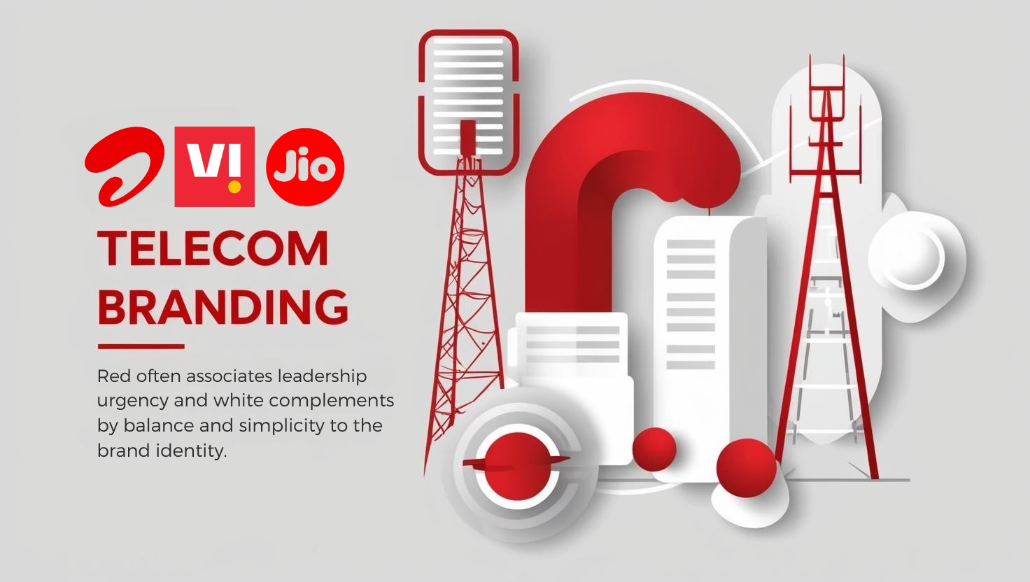
Telecom brands often choose red and white branding in their brand identities because of the influence of colour psychology. Red evokes urgency and excitement, pushing consumers to make quick decisions. White adds balance and simplicity, promoting clarity and trust. This combination is vital in dynamic and competitive markets like India.
Key Takeaways
- Red Stimulates Action: In branding, red inspires urgency and excitement, nudging consumers to decide swiftly.
- White Enhances Trust: White complements red by symbolizing clarity and simplicity, boosting trust and efficiency within the brand.
- Strong Brand Recall: This pairing is particularly effective in telecom. It fosters brand recall and communicates energy.
- Cultural Significance: In Indian culture, red is linked to joy and celebration, creating stronger emotional connections.
- Market Differentiation: Using red and white branding strategically helps telecom brands stand out, enhancing consumer engagement and loyalty.
Colour Psychology in Branding
Red communicates more than just vibrancy—it’s an emotionally charged hue that evokes feelings of urgency and excitement. Many telecom brands lean on red precisely because it reduces analytical thinking, triggering quicker decision-making. This colour taps into instincts, encouraging consumers to act swiftly rather than mull over decisions. Such prompt decisions can mean the difference between choosing one telecom provider over another.
Statistics further underscore the impact of this colour choice, with 76% of people linking red with speed. This perception translates into action; consumers often feel an urgent need to make decisions quickly. Telecom companies, aware of this association, frequently utilize red to stimulate fast consumer reactions.
To further understand, consider these aspects of colour psychology:
Red’s Association with Speed and Excitement
- Urgency: Red signals importance, urging immediate attention and action. It’s associated with warnings or sales.
- Excitement: This colour stirs emotional responses, making brands seem lively and enthusiastic.
Red in branding isn’t just visually striking. It’s a calculated choice to leverage the psychological responses it incites. Telecom companies smartly use it to cultivate a sense of dynamism and immediacy in their brand messages.
Red and White Branding in the Indian Telecom Sector
Red and white branding dominate the brand identities of major Indian telecom companies like Vodafone, Bharti Airtel, and Jio. These colour choices aren’t just aesthetic preferences; they play a strategic role in influencing perception and ensuring brand recall.
Red is often associated with leadership and urgency. It grabs attention and evokes strong emotions. In a fast-paced market like telecom, this colour signifies dynamism and innovation. Telecom companies leverage red to communicate that they are at the forefront of technology and consumer satisfaction. Bharti Airtel, with its striking red, consistently projects itself as a leader in connectivity solutions.
White complements red by adding balance and simplicity to the brand identity. It symbolizes clarity and efficiency, resonating with consumers who seek straightforward and reliable services. This combination helps telecom companies appeal to both tech-savvy users and those less familiar with technological intricacies. It offers a perception of cutting through complexity for seamless communication.
The choice of these colours also aligns with global trends where tech brands employ similar colour schemes. It communicates a universal language of innovation and trust, while still offering regional resonance. For Indian consumers who might associate vibrant colours with fervor and purity, these elements strengthen brand identity in a competitive marketplace.
In essence, these colours together offer Indian telecom brands an advantage, blending emotional engagement with a promise of cutting-edge services, and positioning themselves as leaders in technological advancement.
Contrast with Blue: Trust and Security in Branding
Blue is a dominant colour in tech branding, frequently associated with trust, security, and dependability. Companies like IBM have long embraced blue, capitalizing on its ability to convey these positive traits. A study reports that 34% of people link blue with trust, 28% with security, and 43% with reliability. These characteristics make it a preferred choice for companies that aim to present a reliable and secure image.
While red projects energy and urgency, blue has a calming and reassuring effect. This contrast is essential, especially in the tech industry where reliability and serenity are crucial. The following points explain why blue remains popular among many brands in this sector:
- Trust: The colour blue is associated with sincerity and integrity, qualities that any tech company would want to project.
- Security: Blue suggests a sense of protection and safety, encouraging users to feel their data is secure.
- Reliability: The colour communicates consistency and steadfastness, making it ideal for industries where these traits are valued.
Many tech brands strategically choose blue over red to stand out, emphasizing assurance over excitement when building a strong brand presence. While red excites, blue comforts, serving different purposes but both vital in their domains.
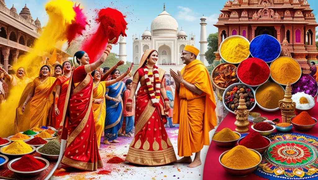
Cultural Significance of Colour in India
In the Indian context, colours convey more than just visual appeal; they resonate deeply with cultural significances that influence perception and emotional connection. Red, for instance, is universally associated with joy, celebration, and spirituality. It embodies exuberance and festivity, which makes it an excellent choice for brands hoping to capture the attention and hearts of Indian consumers. When global telecom brands adopt red in their branding, they’re benefiting from this rich cultural symbolism to build a stronger connection with the local audience.
Understanding cultural variations is essential for global companies entering diverse markets like India. By aligning their brand strategies with local cultural values, they can enhance brand acceptability and loyalty. Here’s why the effective use of colour in branding holds significant weight in the Indian market:
- Symbol of Marriage and Celebration: Red is often used in Indian weddings symbolizing love and prosperity, adding a layer of positive association to brands.
- Religious and Spiritual Contexts: Red is prevalent in numerous festivities and religious contexts, enhancing goodwill and familiarity when adopted by brands.
- Energetic Appeal: The vibrant nature of red injects energy and excitement, ideal for telecom companies that market themselves through dynamic and energetic services and offerings.
For global telecom corporations, adapting brand colour strategies to fit cultural contexts can make or break their success in India. The choice of red is not just about brand visibility, but about embedding the brand within the cultural fabric of the society. By understanding these cultural nuances, international brands can ensure their messaging resonates effectively with Indian consumers.
Impact on Consumer Behavior
Colour significantly influences consumer decisions, accounting for nearly 93% of purchase influence (KISSmetrics). This highlights the importance of its strategic application in branding, especially for telecom companies. The first impression someone forms about a brand relies heavily on colour—up to 90%, Bloomberg reports. This substantial impact is why red and white dominate telecom and tech brand identities. These colours are chosen to evoke certain consumer reactions.
Red is powerful, often signifying passion and urgency. It can energize and stimulate decision-making, compelling consumers towards action. Brands such as Airtel and Vodafone use red to convey excitement and innovation, aligning with their dynamic services.
White, on the other hand, offers balance and simplicity. It signifies purity and sophistication, helping to frame the bolder red in a clean, approachable way. When these colours are paired, they enhance brand visibility and create a memorable identity.
- Consumer Engagement: Red can prompt an emotional connection, making the brand memorable and engaging.
- Brand Recognition: A strong colour palette aids in instantly identifying the brand amidst competitors.
- Trust and Clarity: White supports a trustworthy image, crucial when consumers are considering new telecom services.
Understanding these influences is crucial for marketers in the ever-competitive telecom sector. Red and white branding is not just aesthetic choices but strategic tools to enhance brand perception and influence purchasing behaviors.
Sources:
https://verasolve.com/the-psychology-of-color-in-branding-and-marketing
https://www.ignytebrands.com/psychology-of-color-in-branding
https://www.desantisbreindel.com/insights/technology-brand-colors
https://apiumhub.com/tech-blog-barcelona/how-colors-affect-sales-emotions
Check out our latest insights on Consumer Behaviour here!

